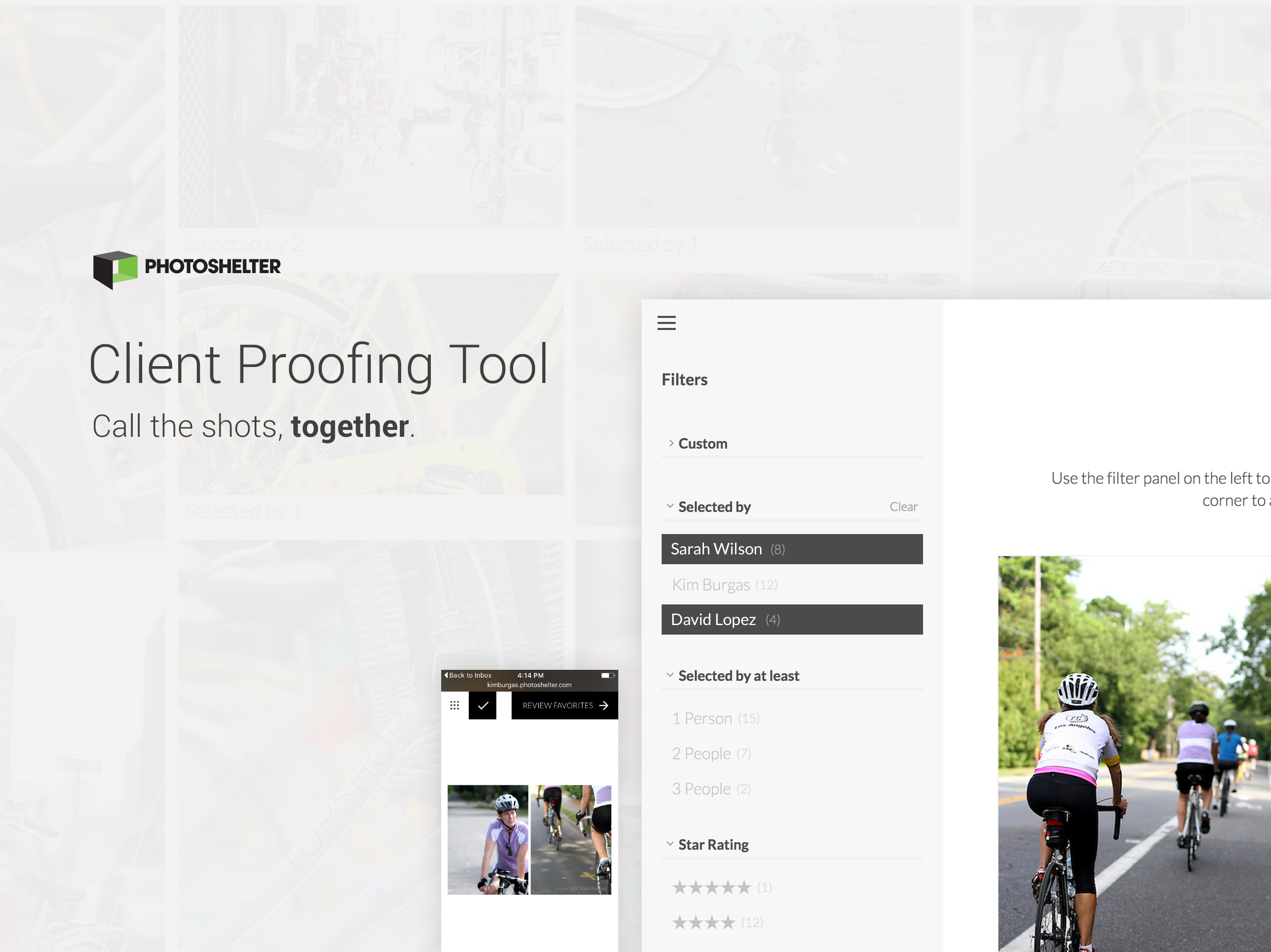
The Client Proofing Tool invites photographers, clients and collaborators to seamlessly share and select favorite photographs together. The tool's modern layout beautifully displays any photographer's work and is easy for even the least tech-savvy client to use.
The Art of Listening...and Acting
In my day-to-day as Lead Designer at PhotoShelter, I hear many users stories that could easily launch further ethnographic research, data analysis, A/B testing, product improvements, and feature requests. I keep a running 'brain dump' list to capture user stories, proposed product improvements, and industry-specific design solutions to come back to at a later time. I find this allows me to actively listen to users and consider all information valuable, while at the same time refrain from straying too far from the objective.
Although infrequent, occasionally I have down-time between product and feature build. This can often serve as valuable time for prototyping. Having a list of pre-specified areas of improvement encourages me to be thinking about and actively advocating for the user at all times, even outside of formal product cycles.
One story that popped up regularly in user research was the lengthy process of a photographer's client(s) sending selects to the photographer. In most cases, the client(s) sends a list of selected photographs' filenames to the photographer. Following the lead of this persistent user story, I worked alongside a front-end developer to prototype a solution.
Process
PhotoShelter has long worked within a psuedo-waterfall approach to product development. The Client Proofing Tool design and build process was unique in that it tested an agile, iterative approach. Our initial sprint team consisted of myself and a front-end developer. Together, we quickly highlighted the user stories, project goals, and intended scope of each sprint phase. We sought to invite a product development process in favor of user intent, as opposed to a long scope detailing product requirements. By focusing more on higher level user needs, the exploratory nature of the project minimized design constraints and thus allowed for a wider range of initial solutions to be presented. Prototyping acts as a process to help answer some questions, and in doing so, ask many more.
Guiding Stories
Some of the user stories that guided the project include:
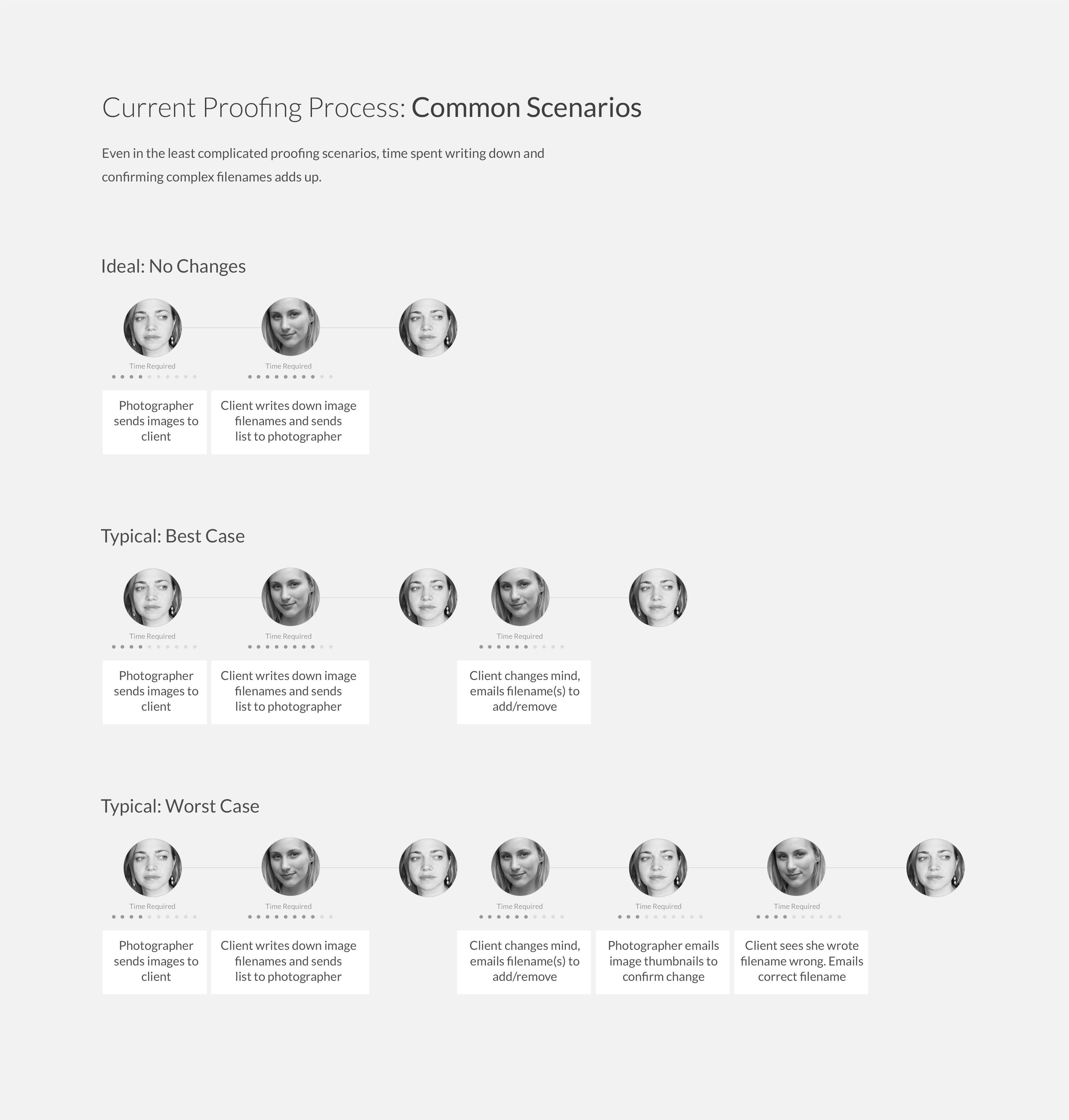
- The proofing process for most photographers is described as an arduous process:
- Words & phrases used: “back-and-forth,” “time-consuming,” “complicated,” “confusing”
- The proofing process for most photographers is idiosyncratic
- The proofing process for most clients involves emailing the filename of selects, which can result in several emails
Objective & Parameters
From a UX perspective, my main objectives were to:
- Simplify the photography selection process
- Reduce costly back-and-forth
- Allow teams to contribute feedback and to see selects in common
- Create an end-to-end, mobile to desktop experience that is enjoyable to use
From a UI perspective, my main objectives were to:
- Support all types (specialities, colors, orientations) of photography
- Reduce visual clutter of filter navigation
- Allow for multi-select filtering
- Communicate a three step select, review and send process
Unlike the typical tech-savvy PhotoShelter user, our user's clients can be less accustomed to interacting with the latest technologies. Take for instance the example of a wedding photographer sending photos to a couple. This couple, in turn, may solicit feedback from their parents or grandparents. I wanted to build an application that would be easy for anyone to quickly understand and use. Because we imagined the tool would be used mostly in one-off scenarios, such as the wedding example, I wanted to require minimal commitment to understanding the tool.
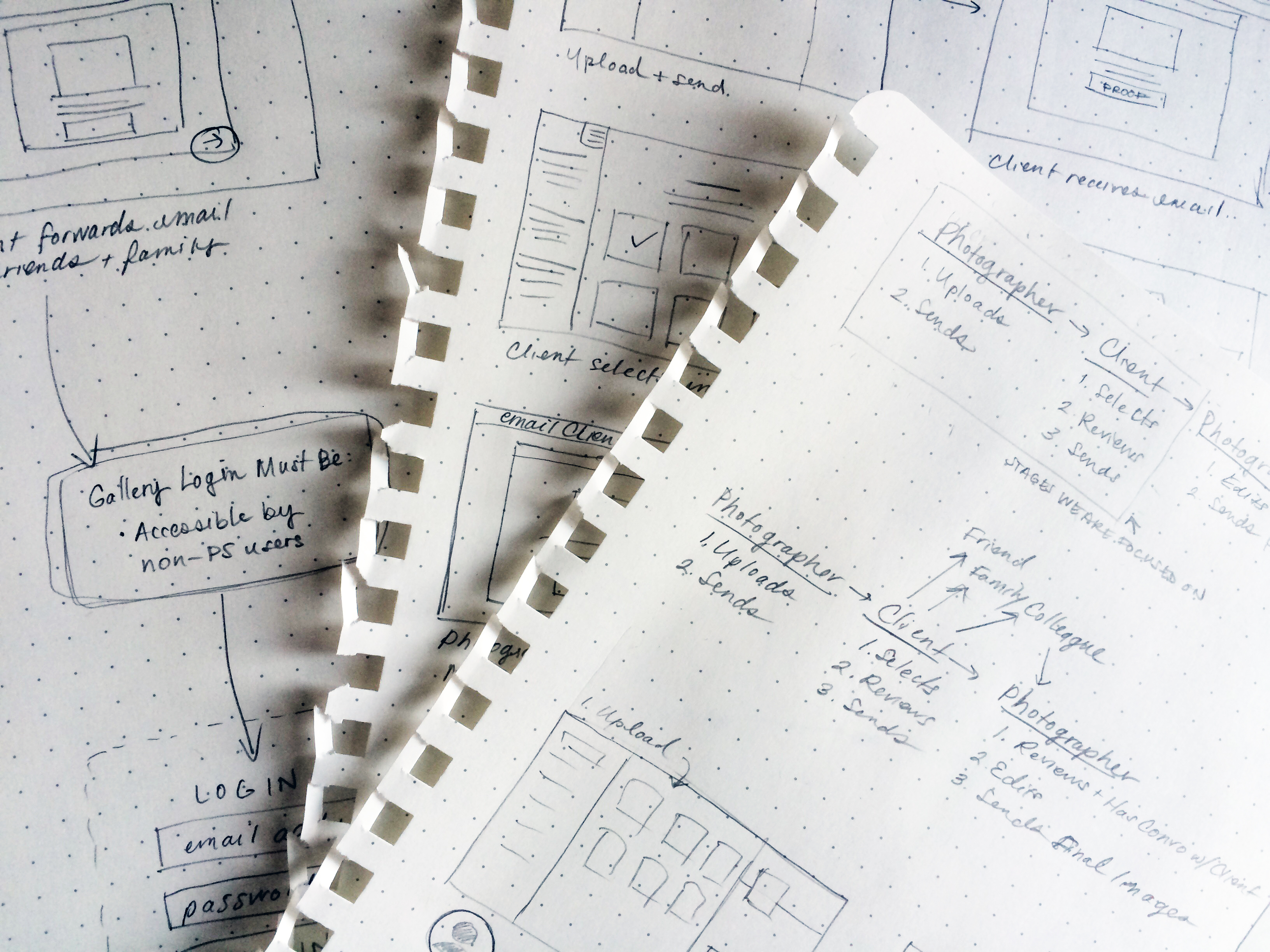
Sketching the UX
Some of the most important factors in reimagining the proofing process were:
- Context-of-use: Where are individuals selecting their images. Are they on the go (mobile) or are they sitting in front of the TV with a tablet or laptop? How might this affect the overall user experience?
- Collaboration: How might users share galleries with their friends, family and colleagues? Are they more likely to forward an email or send a link? Is there another way sharing might also happen? How can a system support multiple collaborators?
- Review Process: As part of the goal was to eliminate back-and-forth and confusion, how can I minimize selection error? How might I focus the user's attention to encourage one to carefully review one's selects before sending the final decision to the photographer?
Color Palette
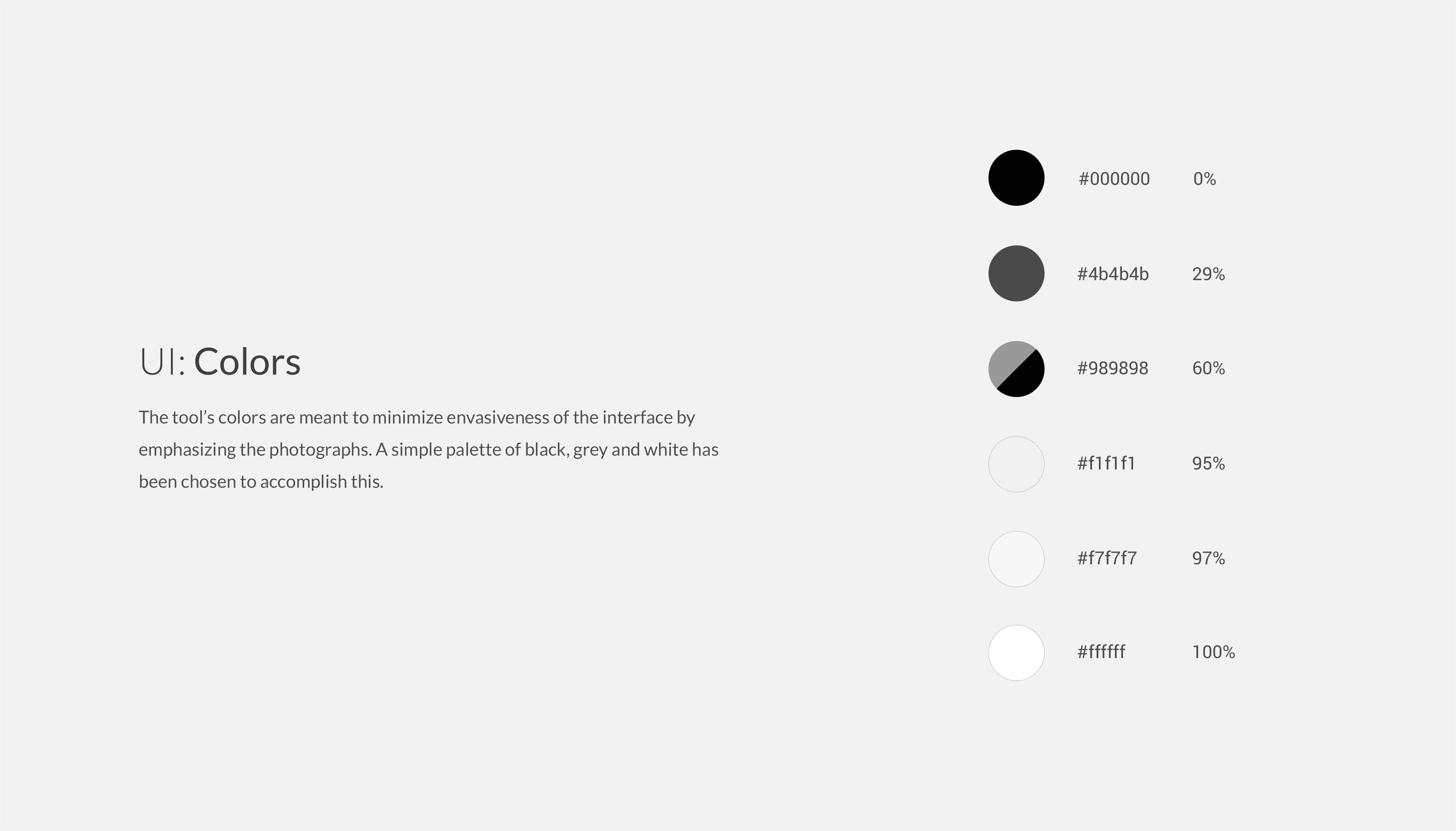
Say what you will about Marissa Mayer, her 5-point rule left me intrigued. While in the end I didn't fully stick to five points (that is just brutal), the creative limitations required me to justify each addition color added to the style sheet. It also pushed me to consolidate styles when possible.
The style guide includes hex codes as well as percentages. Percentages are useful as they allow for design colors to be inverted, to create a dark theme (0% becomes 100%, 29% becomes 71%, and so on).
Typography
Give it a Go!
Want to test it out? Take it for a spin (you will be prompted to sign up for a free PhotoShelter account).

No comments.