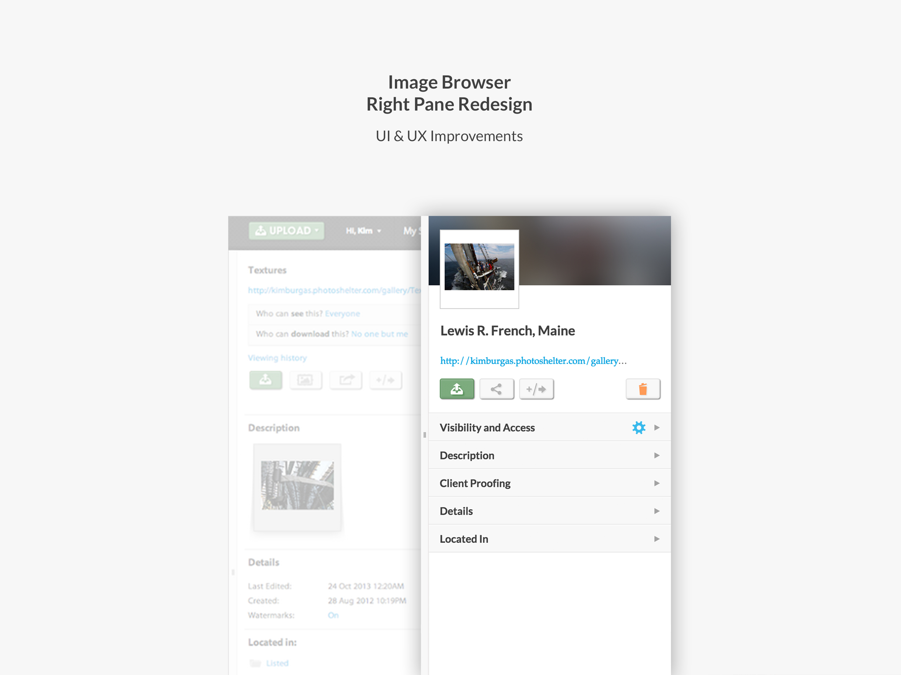
At PhotoShelter, small product improvements and bugs often get bundled together into one large release. One product improvement that came across my plate as a "fix it" item was a rather widely-defined objective to clean up the UI in the right pane of the Image Browser.
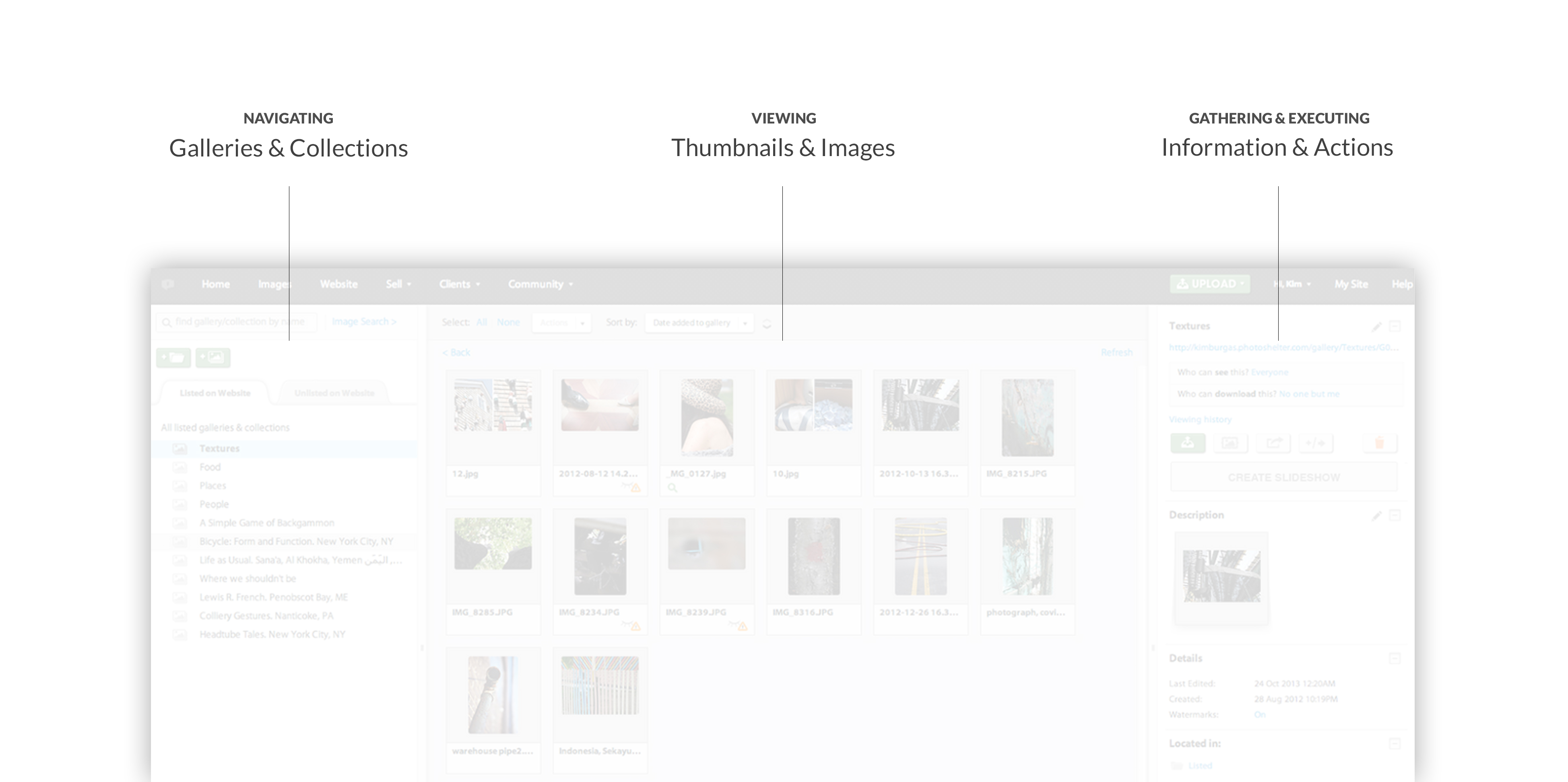
For those that aren't familiar with the Image Browser, let me give you a brief overview. The Image Browser is essentially where a photographer (or organizational members, for our Libris clients) organizes and manages their photo library. The Image Browser has a familiar three section layout, mimicking the structure of many photo editing tools such as Lightroom and Photoshop. Here's an overly reductive breakdown of the system:
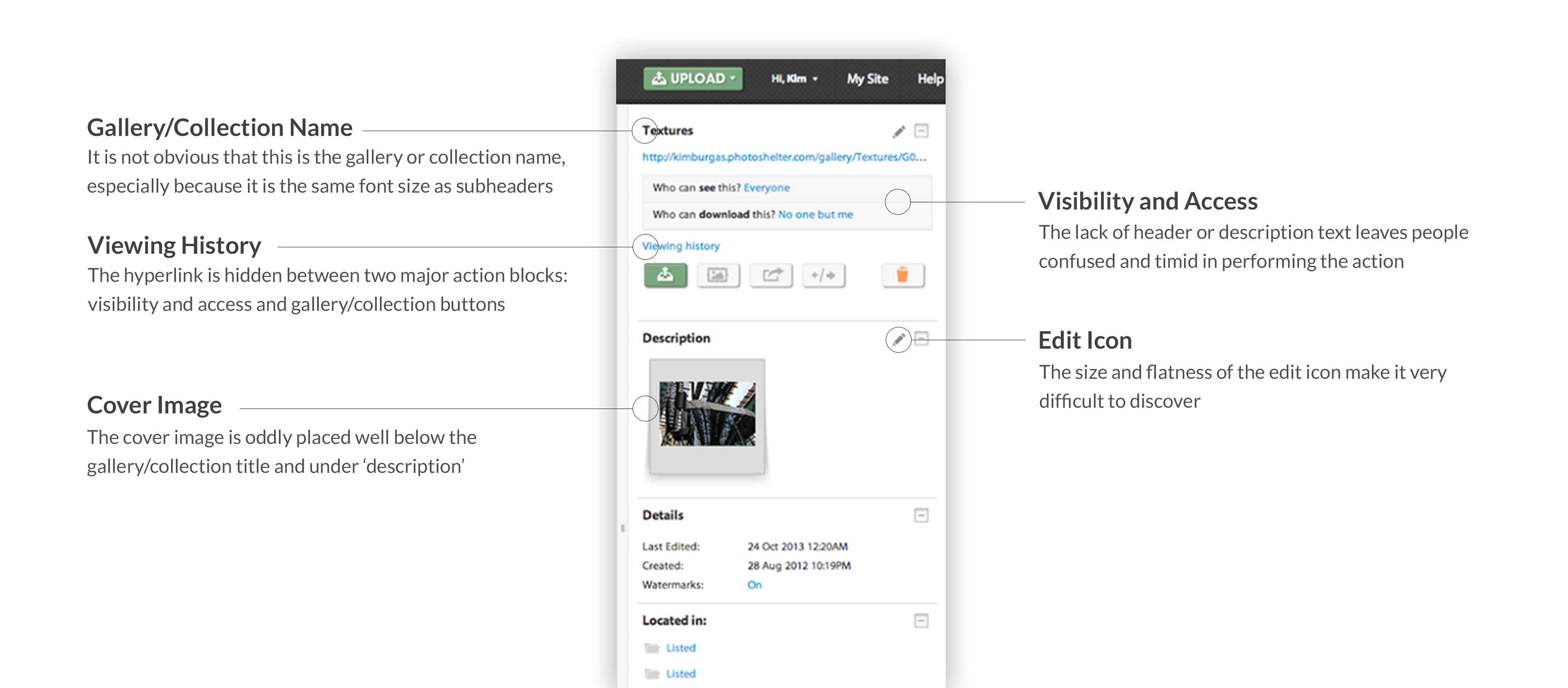
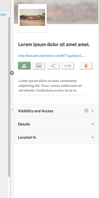
The right pane was in dire need of a clean-up as the entire area lacked hierarchy and intended flow. Here's what I'm talking about:
Rather than seeing this as solely a UI redesign, I took the opportunity to improve overall usability, inviting specific user behaviors that were important to the .
Objective #1: Highlight the Gallery & Collection Description
One major usability concern that surfaced through our Client Services team was the lack of discoverability of the gallery and collection description. For photographers that choose to display their images on a PhotoShelter portfolio, the gallery and collection descriptions are incredibly important as some website templates show this information. Thus, the discoverability of this edit action was a top priority in the redesign.
I designed several solutions in attempting to highlight this action. One sketch placed the gallery description directly under the gallery name, achieving the intended objective. Yet for people with longer gallery descriptions, the design failed in that it pushed the sub navigational items below the fold, not meeting Objective #4 (below).
Sketch 1
It was back to the drawing board. I then thought about collapsing the gallery description. Like so:
Sketch 2
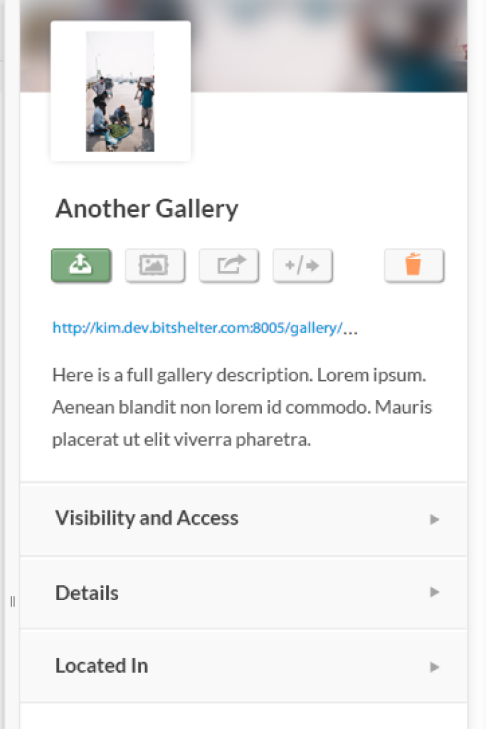
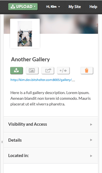
This design was not as easy to implement as I originally thought and added unwanted scope to the project, so I needed to come up with another solution. In the end, I placed the description in a tab below Visibility and Access. This meant that the whole description could be visible when editing, but wouldn't take up unnecessary real estate when the tab is closed.
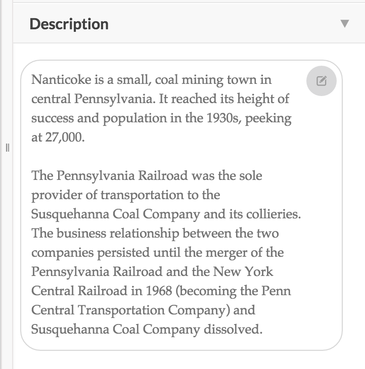
Final design - long description, on hover
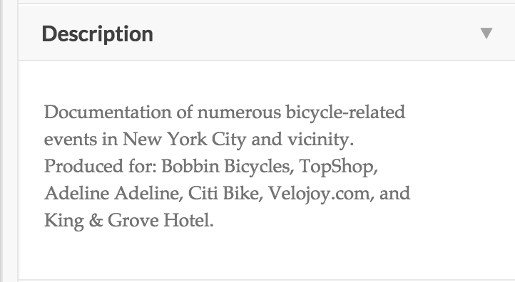
Final design - short description
Objective #2: Encourage People to Add a Gallery or Collection Cover Image
The first sketch was a full-width design:
Because photographers use various photographic orientations (portrait, landscape, panoramic) as their cover images, I knew I would need to allow photographers to adjust their cover image to crop correctly. Like so:

This forced the photographer to do too much work to simply set a cover image. It also implied that the cover image cropping carried into other products, such as the site builder, where we have a separate tool for choosing an image's focal point. Nonetheless, I wanted to continue to pursue the full-width cover image as it gave a location-specific visual cue to the user when quickly browsing across galleries and collections.
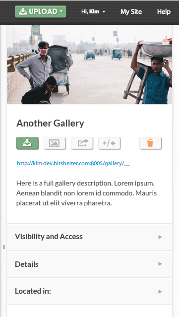
Here's the solution I came up with:
Objective #3: Collapse and Consolidate for Greater Overall Clarity
The previous design assumed that the user needed to see everything in order to get a sense of what the system offered. In the redesign, I consolidated sections, which remained collapsed by default. That way, the user can get a broad overview of the information and actions provided in each view. Furthermore, the user can open a section and switch from gallery to gallery. The section will remain open. This is an incredibly important usability concern as photographers need to quickly skim gallery and collection permissions, as well as image IPTC.
Objective #4: Keep Vital Information Above-the-Fold
For the reasons detailed above, the design needed to allow for all vital information to remain above-the-fold when sections were expanded. I shaved height off the header tabs and removed some space between the gallery title and action buttons to accomplish this goal.
Overall, the design was incredibly successful. We saw nearly a 100% increase in gallery and collection shares.
No comments.